Wednesday, 12 January 2011

week 9


to see my artwork http://ayillustrations.blogspot.com/

Who is your favorite expert ?


Mark Riddick produces art for bands, these often vary from CD cover art to shirt design, the clients (bands) are of a heavy, hardcore nature so the imagery he uses in the illustrations would be aimed at the bands target audience, Riddick’s art is specifically created for a modern heavy metal audience, the imagery captures aspects of the music,
his art is very gory, unholy, and often depict death with a modern composition and style . He has a good ability to capture detail while also an understanding in producing visual pleasing art consistently, his work has a vast amount of detail and imagination. While being compared to other metal/rock artists such as Derek Riggs who created the iconic imagery of iron maiden, his work offers a more modern style and composition
His work would be considered offensive to some people but when you keep in mind who he illustrates for it wouldn’t affect the target audience and they would more possible to like find that sort of thing visually.
Recently i have found that mark Riddick’s art has inspired me more than any other artist, I find the style he works in and the imagery in his illustrations very aesthetic pleasing . his work is similar in ways to mine but i have found myself using his work as inspiration. So i would say my personal favourite expert is mark Riddick.


http://www.riddickart.com/news/


http://riddickart.com/news/?paged=7


Tuesday, 11 January 2011

WEEK 7

Managing a creative a creative environment
Managing a crative environment is important for a illustrator, it is the place were most of the work is created so it shud be practical, comfortable and inspiring. The place should suit the person’s needs as an illustrator, for example for someone who mainly produces digital art then there personal creative environment would have at least one computer and additional components i.e. scanners, printers compared to traditional print makers who would work in a studio. My personal environment is simple it is created for my illustrative style but it is not to distinguished and professional as I’m still developing my style and skills and don’t need specific equipment as i have access to the university’s facility’s.
Comparing my creative environment to that of mel Milton, a charater ceveolper for Disney, His work space is more developed and professional, it is easy to see how some one how works in that can be inspired to create art, and just looking at the image above u can see what sort of work he would produces and how he would create it.

Wednesday, 15 December 2010

week 6


Interpretation
Batman was first created in by comic book artist Bob Kane as part of the detective comics series by DC comics. Batman has been produced through a range of formats since the 1930’s from comics to Hollywood blockbusters
The dark knight was a serious, dark take on batman, alot of the comic that influenced the film are reletivitly dark, atmospheric, disturbing and serious


Comparing the 60’s batman tv series to the 2008 film dark knight directed by Christopher Nolan, the tv series was a colourful, childish, camp adaption of weekly episodes with aspects of comedy. Visually the series looked similar to the comics around at the time, containing bright high contrating colours and slapstick action. The colourful camp effect reflected the hippy period of the America 60’s .The series gave batman a bad reputation and forced writers and artists to take it more seriously in the years following batman became more dark and disturbing and faced real world problems like government issues and situations with the cold war. Artist made batman more darker and throught the years has gotten increasingly darker.
http://uncannykev.com/wp-content/uploads/2010/03/batman_700_cvr-cmyk.jpg
http://www.batmangiftideas.com/adam%20west%20and%20burt%20ward,batman%20and%20robin%20merchandise%20and%20collectibles,batman%20costumes%20and%20toys2.jpg
http://www.megomuseum.com/megolibrary/megoart/images/mego_batmancomic.jpg

Wednesday, 17 November 2010

WEEK 5

Week 5 Character design The wicked witch of the west is a good example of successful character design, she has all the right ingredients that create a good film villain. her clothes consisted of pure black, a stereotypical way to illustrate a bad/evil character but in this film the dark dull black brings a sense of horror when compared with the vibrant colours of the other characters and background along with the painted green face that makes her look slimy and to a curtain extent contrasts with the dark clothes, The witch has strong visual body language not to dissimilar to the body language of Nosferatu from the 1922 German expressionist horror film of the same name in the witch has a slightly crooked posture while being a lot different from how she was first illustrated in 1900 by W.W. Denslow which is less humane, less sinister, less seriously portrayed but more comical, the film version is subsequently more villainous and to this day is considered one of the greatest film villains ever as a result has laid the foundation for villains over the years


Story development

The 1939 film wizard of oz is was based of the novel the wonderful wizard of oz written by L. Frank Baum in 1900 and was directed by Victor Fleming. It was made in the early days of colour technology, so like most films in that era they capitalised on audience anticipation by having a vast amount of vibrant colours.
The film has a good story development and is a excellent usage of the three act structure Act 1 introduces us the main character Dorothy, family, friends and gives the a audience a incite of her way of life. The equilibrium is disturbed when the tornado sends Dorothy to oz from this point the we see the point from Dorothy’s perspective, as she’s in a new world so the viewer can relate more then when she was back home in a environment the character already knew. From oz she has encountered her first problem as she wants to go home and is forced into taking her journey
in act 3 Dorothy’s journey comes to an end she finds out how to get home and takes a valuable live experience from the journey she has just undergone in which she can take home with her, while the other characters realise that what the possessions they journeyed for they had all along and proved so on their travels. The film ends as Dorothy wakes up from, and realises that what just happened was just a dream.


referance


WEEK 4


Week 4
DRAWING
Drawing is one of the most important aspects of a successful RVJ. Drawings are the first step into realising an idea, Rough sketches are important they allow the artist to quickly note down ideas that may come into mind they don’t have to be good at an illustrative view point because they are simply for future reference much like written notes but from a visual viewpoint
the above is “a drawing from Leonardo's notebook and one of his first plans for the Last Supper painting.” it is a perfect example of how drawing in a sketchbook is used, when you compare this to finished painting we can see development and planning, full scale paintings like the last supper take allot of time and money so they would need to be fully sketched out before, the sketch isn’t meant to be a work of art, this would have been one of many sketches and manly designed and annotated purely for the artist and anyone working with the artist at the time. Drawing can also be a form of problem solving. From an illustrative point of view an artist will run into several visual problems, sketches like this can help resolve problems and help the artist create the best composition possible and the best ideas.
referances
http://www.leonardo-da-vinci-biography.com/images/leonardo-da-vinci-timeline.35.jpg
http://www.leonardo-da-vinci-biography.com/leonardo-da-vinci-timeline.html

Monday, 25 October 2010

WEEK 3 - Researching the content


WEEK 3 - Researching the content

AWESOME ARTWORK
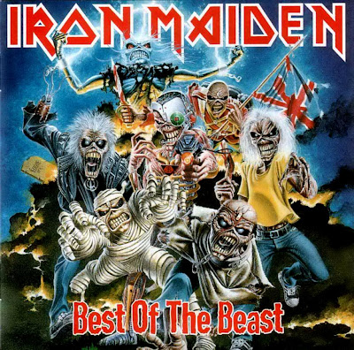
Iron maiden- best of the beast created by Derek Riggs Derek Riggs is the artist behind the band iron maiden’s iconic imagery, the art he created for them is as recognisable as the music itself, going on to produce t- shirts and posters at a highly successful rate. Music is closely linked with art a curtain music audience often relates to a curtain type of imagery, Riggs’ art captures the band’s music perfectly this is important when illustrating for music, the art you create has to communicate and speak to the audience, you wouldn’t pick up this album if you were looking for classical, dance, hip-hop, or pop. And vice versa you wouldn’t expect neon graphics or graffiti on an Iron maiden CD. Riggs’s would have a understanding of the band’s music, lyrics and meaning and would work with the band in producing the art, for most of his album cover he would re draft over and over while members of the band would request changes .The same font for the band name is used on album covers but this is helpful to the audience to recognise the bands CD’s but the font for the album name varies which allows the audience to distinguish between them. This particular album (best of the beast) is a compilation of the band’s best song from previous albums so the artist has combined imagery from them albums all have highly recognisable art work and put them all together for this, so the art work on this album is almost as important as the music given its history and popularity. These illustrations would need fine detail because although albums are small and less detail is needed the same illustrations will be used for large scale posters and promotional material. this album cover is successful like all of them through the years and I feel these have been well produced for their audience and medium

WEEK 3 - Visual hierarchy for the alien poster


WEEK 3 - Visual hierarchy for the alien poster
The visual hierarchy on a film poster is important because a lot of people will see these posters so it’s important to get the visual hierarchy spot on, can be the difference between the audience wanting to see the film or not.
The poster for the film alien (1979) is simple but effective. the first thing on the poster our eyes are drawn to is the egg one of the reasons the audience is draw to it is due to its size, it is relatively big in comparison to the writing, the second reason is the positioning, its centred perfectly in the middle of the page, the last reason and probably most eye catching would be the green glow that surrounds it, due to t he amount of black the poster contains it clashes with the bright green so it jumps of the page The black background and the shadow on the egg creates a dark atmosphere which suggests the film could be a horror, similar to the poster of the film exorcist (1973) which had similar attributes including being very dark and atmospheric.
The title of the film is not the first thing the audience is drawn to but it is obviously pointed out, and lies at the head of the poster overlooking everything else. The typography is plain, simple and in bold this makes the poster look more serious and professional which would stop the audience comparing this to tacky b-movies that were around at that time and previous films over the years which involved aliens,
The only other text is the tag line, “in space no one can hear you scream” this is a line that creates a sense of horror and adds mystery. Because it is smaller than the title and surrounding imagery it is less noticeable and therefore the last thing your eyes are drawn to. The audience will walk away with a slight chill, curiosity and hopefully a desire to see the film...

WEEK 2 audience


WEEK 2 audience
Understanding the audience is key when producing most commercial products, it can be the difference between success and failure a business or company could lose a lot of money because of a lack of audience understanding, researching in this area can insure you create something the target audience is attracted too
the 2009 film watchmen film is based on the 80’s graphic novel of the same name, it is an adult, political take on the superhero genre, the film follows the same principals, the special edition DVD is an example of failing to understand the audience, the DVD case is a special edition cover shaped like a character from the film, the fact the particular characters are available are the most popular and recognisable seems like it misses the point of the film and something more familiar with kids films or TV shows. the manner of the case shows a lack of audience understanding, it is something a child would be interested in, so the fact that the film is violent, political and contains adult themes while been given 18+ certificate it isn’t very suitable, not only that but for someone who’s never read the book or seen the film this case tells you nothing and to a curtain extent sells you something you’re not getting.
Fans of the film and book might well be put off by this and it’s hard to see anyone so taken by this given its childish nature, the original graphic novel covers have become iconic thought out the years since its release due to simplicity and references to the film, the iconic image of the smiley face with a red stain on has become iconic would of been better due to its relationship to the story and the fans. Not only does this case show off a complete lack of audience understanding, the mistakes are incredible obvious to anyone who has seen the film or read the book.

WEEK 2 Inspiration


WEEK 2 Inspiration
art is everywhere around us, a artist can be inspired by almost anything, at anytime of the day a lot of artists gain their inspiration from everyday life, they sketch take photo’s inspiration is a major factor in producing art, without inspiration art bland, boring and probably none existent, the greatest artwork in history have been inspired whether that be from text or from life it self
Inspiration can b closely linked with research, and in many cases are very similar, researching into the work of a artist can lead to inspiration for instance looking at a curtain time period can influence the way you draw or what you draw. Other influences to him is music, films and games some of his work including the image above is clearly influenced by games suggested not only the pixelated style but also the characters, they are not too different from video games from the 80’s and early 90’s.
Jon Burgerman is a modern illustrator whose work closely resembles doodles and has produced work for a range of medias and people. Jon burgerman has developed a reputation for the way he produces art, he is known for drawing things around him, he often makes characters from doodles he creates from looking at people., They are often very crude and childlike which mirrors his professional work. Getting inspired by things that are in front of you is the perfect way to capture life, it’s a lot like primary research, what you see is true and hasn’t been mixed up with someone else’s imagination.
a drawing isn’t just a visual record but can be about yourself, however your feeling can be reflected in your art, Jon Burgerman’s art reflects his personality, most of his work involves happy doodles and characters another form of inspiration.

WEEK 1 notions of originality


WEEK 1 notions of originality
A 2006 a band called tenacious d released a sound track album for their comedy film. The Art work for this album was a recreation of Michelangelo’s creation of Adam. The creation of Adam is a biblical scene painted by Michelangelo in 1511 it tells a story from the book of genesis “in which god the father breathes life into Adam, the first man.” At the time the painting was creating the general public could not read so these religious paintings told them the stories. The creation of Adam is a extremely well known and one of the most recognisable pieces of art in history and has been and has been recreated and altered a number of times in history
in this version god and Adam have been replaced by the two band members this is re-created with comedy in mind, the form and concept behind the picture has clearly been taken from the original but the modernisation of this piece it is more relatable in today’s society, religion does not mean as much and is not taken more lightly but although some religious people may find this offensive the bands target audience most probably won’t. Another change made from the original is nudity, in the original Adam was completely naked in the re creation nudity has been removed, as attitudes to religion have become less serious the human body has taken the opposite path as nudity is kept away from public places.
the intension isn’t trying to make you think they created a completely new idea but to symbolise what there band is about, there music revolves around comedy and you can tell this album cover isn’t meant to be taken serious, even if you are not aware of the original, its more of a stab at themselves,
A other version of this is the poster from the film Bruce almighty similar changes have been made only Jim Carrey is replacing Adam similar changes have been made, it’s also a comedy the originality of these pieces is how they relate to the society and to its audience.