Monday, 25 October 2010

WEEK 3 - Researching the content


WEEK 3 - Researching the content

AWESOME ARTWORK
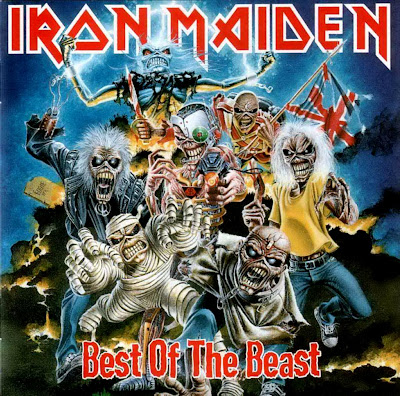
Iron maiden- best of the beast created by Derek Riggs Derek Riggs is the artist behind the band iron maiden’s iconic imagery, the art he created for them is as recognisable as the music itself, going on to produce t- shirts and posters at a highly successful rate. Music is closely linked with art a curtain music audience often relates to a curtain type of imagery, Riggs’ art captures the band’s music perfectly this is important when illustrating for music, the art you create has to communicate and speak to the audience, you wouldn’t pick up this album if you were looking for classical, dance, hip-hop, or pop. And vice versa you wouldn’t expect neon graphics or graffiti on an Iron maiden CD. Riggs’s would have a understanding of the band’s music, lyrics and meaning and would work with the band in producing the art, for most of his album cover he would re draft over and over while members of the band would request changes .The same font for the band name is used on album covers but this is helpful to the audience to recognise the bands CD’s but the font for the album name varies which allows the audience to distinguish between them. This particular album (best of the beast) is a compilation of the band’s best song from previous albums so the artist has combined imagery from them albums all have highly recognisable art work and put them all together for this, so the art work on this album is almost as important as the music given its history and popularity. These illustrations would need fine detail because although albums are small and less detail is needed the same illustrations will be used for large scale posters and promotional material. this album cover is successful like all of them through the years and I feel these have been well produced for their audience and medium

WEEK 3 - Visual hierarchy for the alien poster


WEEK 3 - Visual hierarchy for the alien poster
The visual hierarchy on a film poster is important because a lot of people will see these posters so it’s important to get the visual hierarchy spot on, can be the difference between the audience wanting to see the film or not.
The poster for the film alien (1979) is simple but effective. the first thing on the poster our eyes are drawn to is the egg one of the reasons the audience is draw to it is due to its size, it is relatively big in comparison to the writing, the second reason is the positioning, its centred perfectly in the middle of the page, the last reason and probably most eye catching would be the green glow that surrounds it, due to t he amount of black the poster contains it clashes with the bright green so it jumps of the page The black background and the shadow on the egg creates a dark atmosphere which suggests the film could be a horror, similar to the poster of the film exorcist (1973) which had similar attributes including being very dark and atmospheric.
The title of the film is not the first thing the audience is drawn to but it is obviously pointed out, and lies at the head of the poster overlooking everything else. The typography is plain, simple and in bold this makes the poster look more serious and professional which would stop the audience comparing this to tacky b-movies that were around at that time and previous films over the years which involved aliens,
The only other text is the tag line, “in space no one can hear you scream” this is a line that creates a sense of horror and adds mystery. Because it is smaller than the title and surrounding imagery it is less noticeable and therefore the last thing your eyes are drawn to. The audience will walk away with a slight chill, curiosity and hopefully a desire to see the film...

WEEK 2 audience


WEEK 2 audience
Understanding the audience is key when producing most commercial products, it can be the difference between success and failure a business or company could lose a lot of money because of a lack of audience understanding, researching in this area can insure you create something the target audience is attracted too
the 2009 film watchmen film is based on the 80’s graphic novel of the same name, it is an adult, political take on the superhero genre, the film follows the same principals, the special edition DVD is an example of failing to understand the audience, the DVD case is a special edition cover shaped like a character from the film, the fact the particular characters are available are the most popular and recognisable seems like it misses the point of the film and something more familiar with kids films or TV shows. the manner of the case shows a lack of audience understanding, it is something a child would be interested in, so the fact that the film is violent, political and contains adult themes while been given 18+ certificate it isn’t very suitable, not only that but for someone who’s never read the book or seen the film this case tells you nothing and to a curtain extent sells you something you’re not getting.
Fans of the film and book might well be put off by this and it’s hard to see anyone so taken by this given its childish nature, the original graphic novel covers have become iconic thought out the years since its release due to simplicity and references to the film, the iconic image of the smiley face with a red stain on has become iconic would of been better due to its relationship to the story and the fans. Not only does this case show off a complete lack of audience understanding, the mistakes are incredible obvious to anyone who has seen the film or read the book.

WEEK 2 Inspiration


WEEK 2 Inspiration
art is everywhere around us, a artist can be inspired by almost anything, at anytime of the day a lot of artists gain their inspiration from everyday life, they sketch take photo’s inspiration is a major factor in producing art, without inspiration art bland, boring and probably none existent, the greatest artwork in history have been inspired whether that be from text or from life it self
Inspiration can b closely linked with research, and in many cases are very similar, researching into the work of a artist can lead to inspiration for instance looking at a curtain time period can influence the way you draw or what you draw. Other influences to him is music, films and games some of his work including the image above is clearly influenced by games suggested not only the pixelated style but also the characters, they are not too different from video games from the 80’s and early 90’s.
Jon Burgerman is a modern illustrator whose work closely resembles doodles and has produced work for a range of medias and people. Jon burgerman has developed a reputation for the way he produces art, he is known for drawing things around him, he often makes characters from doodles he creates from looking at people., They are often very crude and childlike which mirrors his professional work. Getting inspired by things that are in front of you is the perfect way to capture life, it’s a lot like primary research, what you see is true and hasn’t been mixed up with someone else’s imagination.
a drawing isn’t just a visual record but can be about yourself, however your feeling can be reflected in your art, Jon Burgerman’s art reflects his personality, most of his work involves happy doodles and characters another form of inspiration.

WEEK 1 notions of originality


WEEK 1 notions of originality
A 2006 a band called tenacious d released a sound track album for their comedy film. The Art work for this album was a recreation of Michelangelo’s creation of Adam. The creation of Adam is a biblical scene painted by Michelangelo in 1511 it tells a story from the book of genesis “in which god the father breathes life into Adam, the first man.” At the time the painting was creating the general public could not read so these religious paintings told them the stories. The creation of Adam is a extremely well known and one of the most recognisable pieces of art in history and has been and has been recreated and altered a number of times in history
in this version god and Adam have been replaced by the two band members this is re-created with comedy in mind, the form and concept behind the picture has clearly been taken from the original but the modernisation of this piece it is more relatable in today’s society, religion does not mean as much and is not taken more lightly but although some religious people may find this offensive the bands target audience most probably won’t. Another change made from the original is nudity, in the original Adam was completely naked in the re creation nudity has been removed, as attitudes to religion have become less serious the human body has taken the opposite path as nudity is kept away from public places.
the intension isn’t trying to make you think they created a completely new idea but to symbolise what there band is about, there music revolves around comedy and you can tell this album cover isn’t meant to be taken serious, even if you are not aware of the original, its more of a stab at themselves,
A other version of this is the poster from the film Bruce almighty similar changes have been made only Jim Carrey is replacing Adam similar changes have been made, it’s also a comedy the originality of these pieces is how they relate to the society and to its audience.

WEEK 1 Relationship developed from existing form of historical culture


Marc Quinn statue of Alice Lapper a pregnant women who was born with no arms and short leg was displayed from September 2005 to April 2007 in Trafalgar square marc Quinn thought the statue could embody a new kind of heroism, comparing her to the British icons that surrounded her “in the past heroes such as nelson have conquered the outside world, now t seems to me they are conquering their own circumstances and the prejudges of others.” The subject Alison Lapper called the statue of herself “A modern take on femininity she regards her own body as a thing of beauty and a strong image of motherhood”. The statue of Alison Lapper has been compared to the most famous piece of work depicting the female beauty the Venus De Milo.
The Venus De Milo is a famous ancient Greek marble sculpture created around the time of 130 – 100BC currently residing in Louvre museum in Paris “it is believed to depict Aphrodite the Greek Goddess of love and beauty” Greek art often showcased the naked body as a thing of beauty it was part of their culture.
The Venus De Milo’s most famous feature is the missing limbs which have disappeared since its ancient creation which is the main reason for its fame and popularity. Although the form of these sculptures is different, the main similarly is they both have no arms but the reason for this different, but at the same time they both share the proud facial expression which is a powerful statement towards disability.
Many people see the Venus De Milo as a work of beauty and is in the Paris Louvre which contains some of the most famous artwork in history. Quinn’s statue has received harsh criticism from the public and art critics. The disability subject is the reason for this controversy but also the main attraction which is another similarity it shares with the Greek statue.